
A holistic brand design system for Handelszeitung.
Preserving identity. Expanding possibilities.
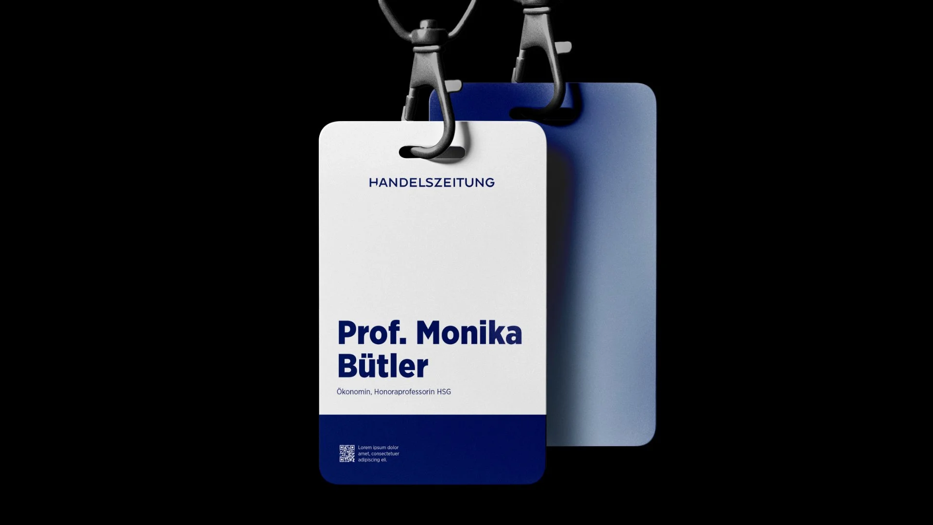
Together with the HZ brand team, we developed a unified design system for the entire HZ brand portfolio. It brings together Handelszeitung, podcasts, newsletters and sub-brands such as HZ Insurance – with clear foundations and room for individual expression.
Zurich, Switzerland
2026
The starting point
Handelszeitung is Switzerland’s leading business newspaper. Its established wordmark, distinctive typography and signature blue colour palette give it a strong brand identity. However, undersized logos, insufficient text contrast, and inconsistent, rigid layouts limited its application. The existing brand book needed to evolve to address these weaknesses and build on the brand’s strengths – enabling clear, flexible and consistent communication across the entire HZ brand portfolio.
The approach: simplifying and unlocking potential
We began by reviewing the existing brand book and current applications. Working together, we identified clear areas for improvement: simpler layout principles, measurable colour contrast, clear guidelines for calls to action and a systematic approach to partner logos. One overarching question guided the process: how could the existing brand elements evolve to offer greater creative flexibility while providing clear direction?